Spring is my most second favorite season of the year (fall wins, because… the leaves, and my birthday!). I’ve been doing the happy dance ever since I saw the first bright green buds on the trees in my backyard this season. It seemed like overnight, everything was new and bright and alive again. I just love it! Well most of it. I could go without quite so many April showers, pollen-nados and here in the South, actual tornadoes…
But that’s all behind us now (I hope) because it’s MAY – with all the flowers, graduations, birthdays, anniversaries, holidays, and pre-summer joy it brings.
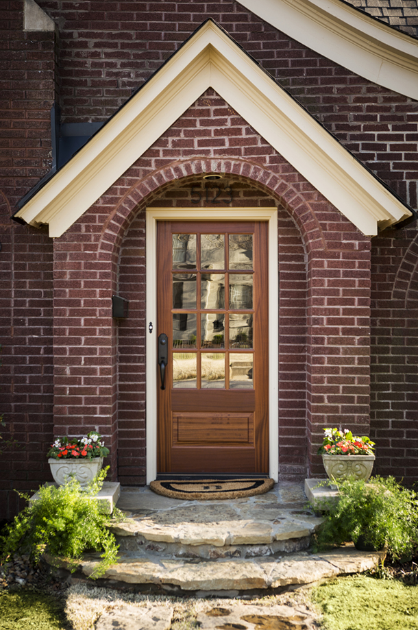
One of the special joys this May in particular brings for me is the long-awaited unveiling of a project dear to my heart – the charming and colorful storybook cottage remodel in the Hillcrest neighborhood of Little Rock!


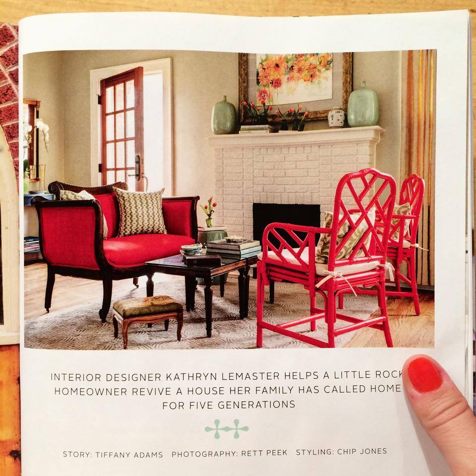
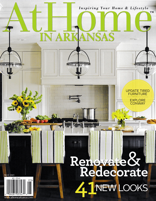
A huge thank you to At Home in Arkansas Magazine for the beaming feature that so beautifully communicates the creativity, heart and soul behind this project. Be sure to read the full story and see more of the wonderful photos by Rett Peek, here!
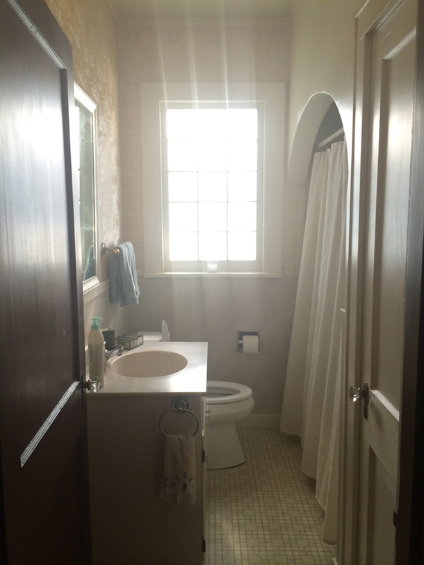
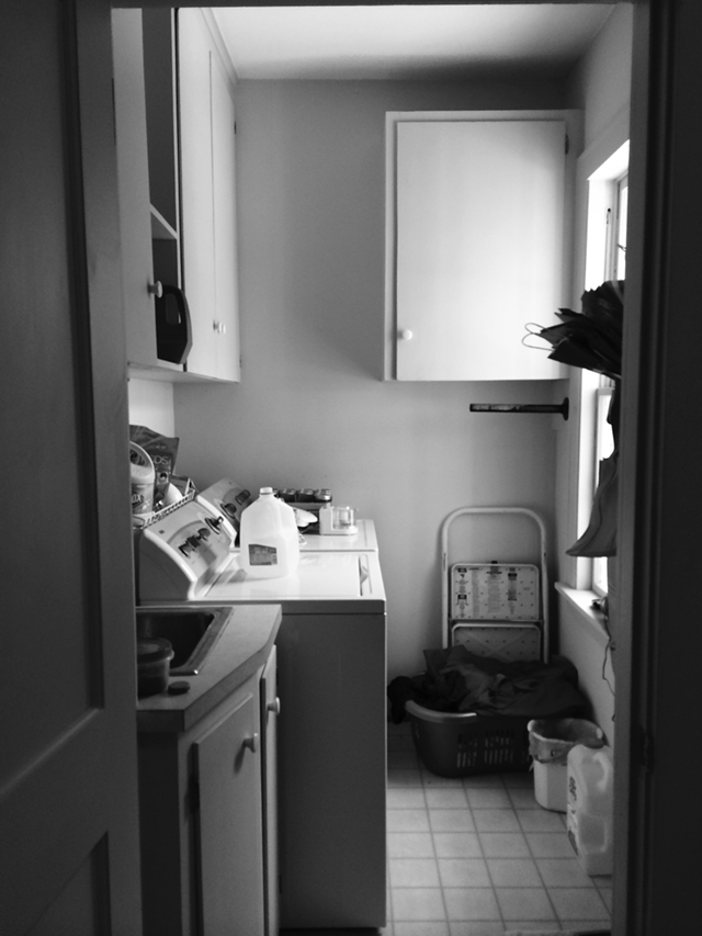
The kitchen was the most extensive portion of the remodel, so to appreciate just how far it came from it’s less-than-thrilling beginnings, I’ll leave you with a few “before” photos for reference…
Change is good, yes? 😉 Here’s to beautiful seasons of transformation and newness!!
xo,
Kathryn
PS! If you’re new here, thanks so much for dropping by. I’d love to keep in touch! I recently completed my first ever free downloadable resource for my readers (my top paint colors, hello!) and would love to gift that to you for joining my “E-Party”! If you missed or exited the pop-up invite upon arriving here, you can simply scroll down to the bottom of this page to find the invite. Easy peasy!
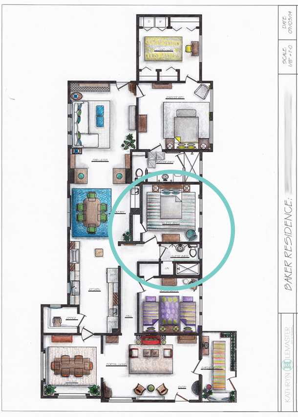


 The first step with any design is to think through the functionality goals, storage, and traffic needs of the users in the space. Notice the changes from the existing plan above (and before pictures) to the new design drawings below:


 The base of the color scheme started with wanting creamy cabinets with a cocoa glaze to contrast with warm wood floors, stained beams and stained island. The accent colors were inspired by Jessica’s favorite hue, turquoise. Selecting oranges as the other accent color followed suit as being the natural complimentary color to blues, as well as playing off of some inspiration pieces of pottery!
 (Upon entrance from the left/south end)
 (Sink area to left)
 (Cooking area to right)
 (Breakfast peninsula to left)
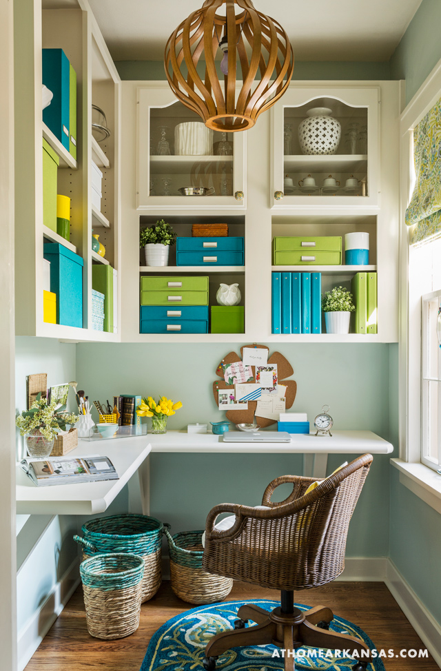
 (Study/Office beyond peninsula)
 (Turning back toward entrance)
 (Looking back toward entrance)

 I can’t wait to share a few of my favorite photos from the trip with you after I finish sorting through them.
 More importantly though, I’ve hit the ground running with projects for the year, which trumps my excitement about the new office supplies by like… a zillion times! 🙂
 Progress is in motion on current projects gearing up for completion, as well as on new projects I’m just diving in to. Above is a peek at some of the treasures I’ve scooped up to do some styling for a project next week!
 This sneak peek was shared on my Facebook page, but incase you missed it, here was another before and after preview from the master bedroom:
 Exciting, right?!