“The podcast for those who want to play it safe while living dangerously” – if that doesn’t sound interesting I don’t know what does! Recently I had the pleasure of being interviewed over coffee and Skype by podcast personality Michael Beattie for his fun and informative show, Travel + Safety! Michael is an Italian and English native who ended up in California and now resides in the Florida Keys. 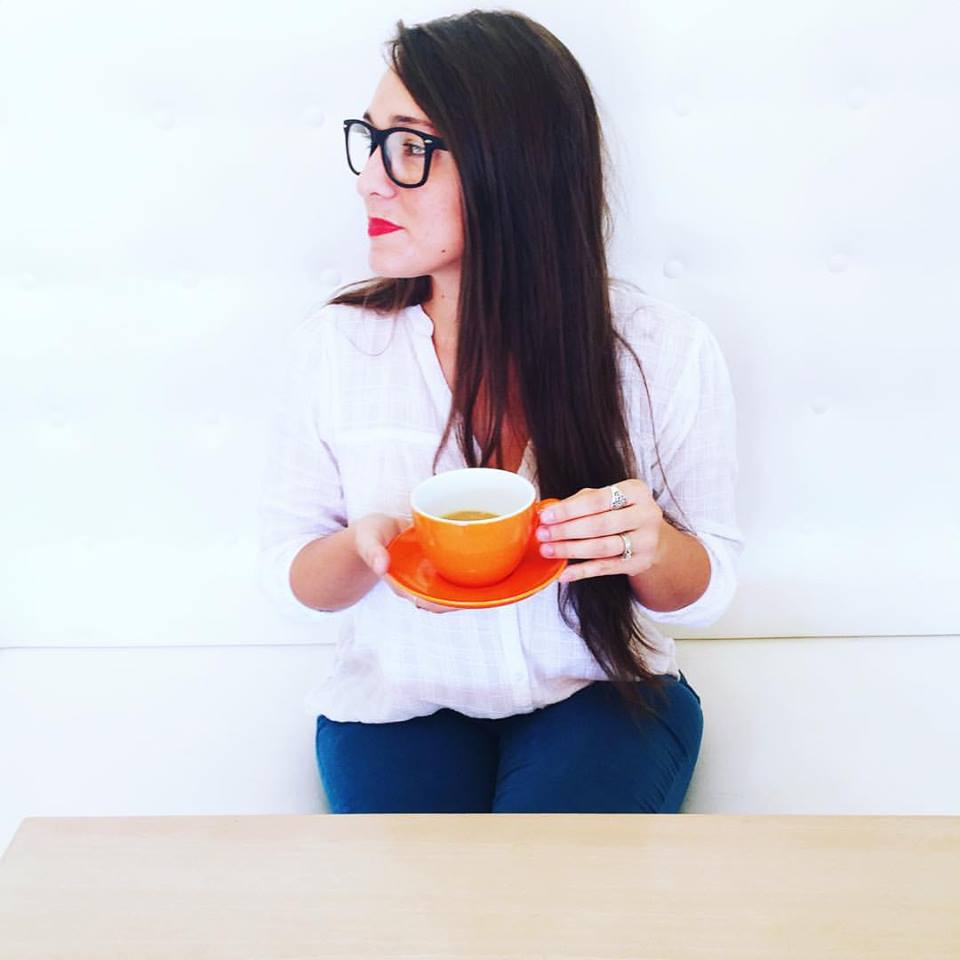 In this episode, we talk a bit about my upbringing, living in the “Natural State”, some design philosophy Q&A, traveling for work, and more! Michael was a true delight to visit with and I found myself wanting to ask him more questions than he asked me during our chat. While I can’t say much for my southern accent (which I didn’t realize was evident until I heard myself talk…) you are certainly in for a treat when it comes to Mr. Beattie’s British accent. 😉 Click the link below to listen to our show!
“TAS033: Experiencing the Incredible Lightness of Being with Kathryn LeMaster ”
I hope you enjoy the show and learn a little something new, too! 🙂


 The first step with any design is to think through the functionality goals, storage, and traffic needs of the users in the space. Notice the changes from the existing plan above (and before pictures) to the new design drawings below:


 The base of the color scheme started with wanting creamy cabinets with a cocoa glaze to contrast with warm wood floors, stained beams and stained island. The accent colors were inspired by Jessica’s favorite hue, turquoise. Selecting oranges as the other accent color followed suit as being the natural complimentary color to blues, as well as playing off of some inspiration pieces of pottery!
 (Upon entrance from the left/south end)
 (Sink area to left)
 (Cooking area to right)
 (Breakfast peninsula to left)
 (Study/Office beyond peninsula)
 (Turning back toward entrance)
 (Looking back toward entrance)
 Did I mention this was also my home? Yes. I am a UCA alumni and I loved the four years I spent on their beautiful campus full of historic buildings and lush landscaping going through the interior design program.
 The goal of the finishes design is to have a versatile, neutral palette that leaves flexibility for the groups to personalize and make each space their own. By providing a clean and simple, sophisticated color palette, I want to help them create the perfect canvas as a foundation for the furnishings and decor to come.
 Yesterday was an especially special day in the project – the groundbreaking ceremony at the Greek Village site! Each sorority had their letters set up in the clearing near the location of their future houses – too cool.
 There was a fantastic turnout, and after hearing from several speakers including President Courtway, the event wrapped up with the highly anticipated golden shovel ceremony. The president and board members scooped the first shovels full of dirt, then everybody jumped in on the fun!
 I was delighted to be included in the festivites, especially standing among all of these great and talented folks from UCA, Nabholz Construction, and Caradine Architects. What fun!
 It was like a bunch of kids in a sand box, just more organized. Let’s face it – playing in a dirt pile is fun. Especially with shiny golden shovels!
 Of course I had to get a shot with two of the fabulous ladies I’ve enjoyed working with on the team from UCA: Diane Newton and Wendy Holbrook!
 What a day – and what a year it will be now that construction has officially begun. And by construction I mean our expertly excavated dirt piles. Luckily Nabholz will be setting up shop on site soon to take over from here. I’m sure they will appreciate the head start. 😉


 (Photos by Trevor and Jenni Thurow via
 .jpg) We decided the best way to preserve the integrity of the authentic scraped texture of the beams would be to create something that incorporated as much length and as little cutting as possible. Thus we decided a dining table would be the way to go.
We decided the best way to preserve the integrity of the authentic scraped texture of the beams would be to create something that incorporated as much length and as little cutting as possible. Thus we decided a dining table would be the way to go. The concept was based on 45 degree or similar angles to create variations of diamonds or herringbone patterns. I wanted to try and create a “twist” like appearance to give the table visual movement – adding a fresh spin, creating a not-so typical farm table. These beams deserved a unique design!
 As you can see from the below action shot of Trevor, construction is currently underway at his shop in Austin, TX. I’m so excited!!
 You can follow Trevor’s updates on the project through his Facebook album,
  Way to go, Trevor! I just can’t get over the wood. The weather gray hand-scraped side or the fresh cut oak center. It’s absolutely gorgeous!
 (before)
 (during)


 *enter room* It’s very… coral? I love coral! Why don’t I love it in here? Ah – it’s a tall skinny room with inadequate lighting. The coral is closing in around me and I don’t like it in this application. Glass shower… that’s nice. I wish it were frameless. The frame lines make for so many right angles. I think I want to hide it. Something soft. Note: I feel uneasy. Change wall color. Something calm. Add soft billowing curtain to cover shower.
 Speaking of inadequate lighting, what kind of lights are even in here? *look up* 1…2…3 can lights. One over shower, two off centered over vanity. Two windows is good natural light. But I want more overhead light. I love light. It helps the space feel bigger. It helps you see. And the right light fixture makes such an artistic statement. Note: Add fun lighting. Something on wall over vanity, something in the center of the ceiling.
 *look down* Hm, nice travertine floor. It looks cold though. Maybe it is cold, from the air vent. Don’t love air vent placement. Don’t love tiny fluffy crooked rug. But I want something soft. How would two bath mats work in here? They’d fit, but I don’t love where how they would fit. I want to unify the space. I want one rug. I want a runner! Note: Look for skinny runners (not the marathon type, the decorative type.) Ask if it’s a problem to cover air vent temporarily for “show.” If that’s a no-go, can I cut out a hole in the rug for the vent? Hmmm…
 *look back* More coral. Yep, definitely need a new color. Hey, those electrical outlets and switches stick out like a sore thumb. I want to hide them. And hey, are there no towel bars in here? How will I dry my hands? Note: tall floral arrangement in corner to distract from switching/outlets and towel ring next to them to dry hands on way out the door.
 *look to right* I like the vanity color, and the cute little feet. What’s bothering me? Ah – the countertop. It’s cultured marble with a poured sink and back-splash. Why does it look like plastic to me? I would love to upgrade that. That would be expensive. Hey, there’s satin nickel hardware everywhere. Shinier would look nicer here. Note: Go over budget and look at upgrading counter-top. Something white. Marble? Quartz? Change out all satin nickel hardware for chrome.
 *look closer at vanity* While I’m thinking of upgrades… how COOL would a glass vessel sink with a waterfall faucet look in here?! I mean this is alright… it works. But something sleek and spa-esque would really help accomplish the feel I’m going for. Note: Pinch pennies to get new countertop… so that I can get a glass sink and faucet. Yep, definitely want to do that.
 *look to left* It already has wooden blinds… those can stay, you need privacy in a bath. One again, so many right angles. The window needs to be softened. Drapery? Floor panels are sort of impractical for a bath, but especially one with a shower. Cornice? Valance? Yes. Nothing overwhelming. Just a simple “hat” for the window to soften the corners and bring in pattern/color. Note: Pull images of outside-mount window treatment style options. Think about fabric. Call seamstress for quote.
 *walk back to entrace and turn around for another look* Yep. The shower is fine but nothing special. Drapery in front of it would be prettier. The countertop will do, but if I can swing it, and new one and new sink/faucet would be fabulous! The mirror is too square for all of the right angles already happening in here. Maybe round? Definitely want to add a wall sconce over the mirror, or maybe one on either side of it. Hey, a giant piece of art or a grid of several pieces would look swell between the mirror and shower! Okay, yes, good talk with myself. I have something here. This could be great.