Happy October!!
Fall is my absolute favorite season, of which October always feels like the official kick-off to me. It’s the best month of the year in my book, which is why I am especially thrilled to have a fall decor project included in this month’s issue of At Home in Arkansas magazine! Snatch up a copy and mosey on by their website to read the full feature – aptly titled “Welcome to Fall!” – for more lovely photos and fall decor ideas!
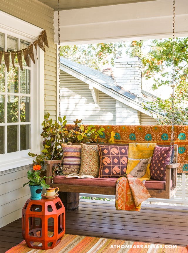
Here’s a preview of “Look #1: Cheerful, Warm, Eclectic” – designed my moi and styled with the expert assistance of Editor in Chief, Chip Jones, topped off with glorious photography by Rett Peek!
Behind the scenes bonus material! (Crafting, coffee consumption, and amature photography by moi as well…)
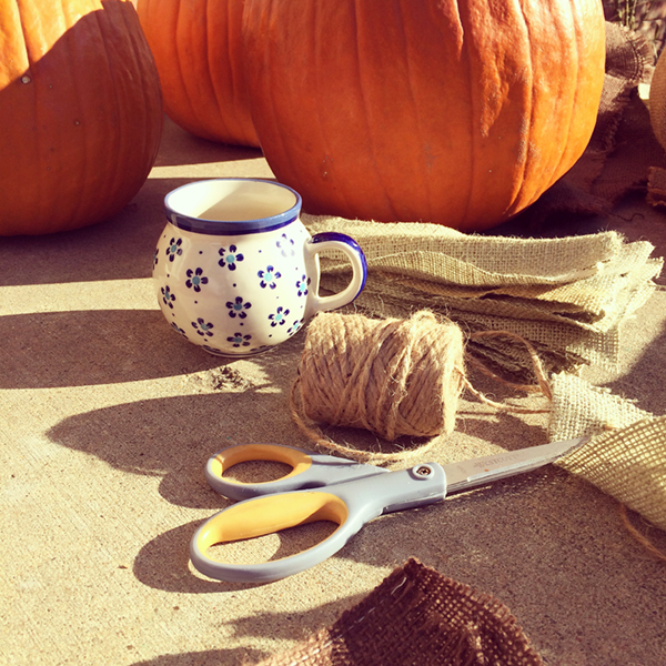 Burlap and twin garlands and pumpkin wraps in progress. Produce hunted down at various pumpkin patches and grocery stores. Materials found at local craft stores and my garage. 😉
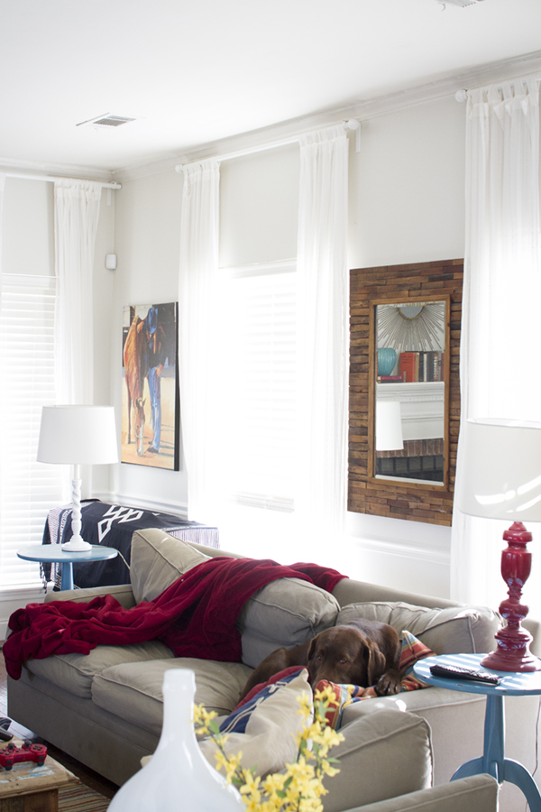
 Nothing like a few handmade Kantha quilts and pillows made from recycled Indian saris to warm up a space! Available at my favorite yoga studio, Arkansas Yoga Collective.
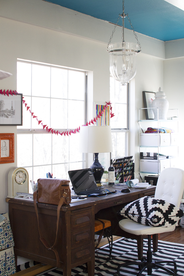
 Styling away! My estate sale retro side table had to come along, of course. So did a few fun rugs from Cynthia East Fabrics. The Gerber daisy and ceramic planter were less than $10 combined at Home Depot. #score
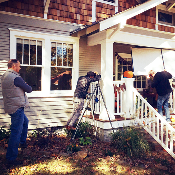
Ready, set, shoot!
 The pros, making that photo magic.
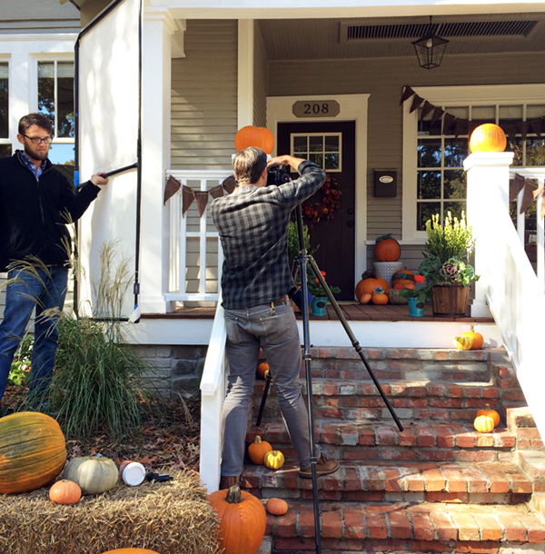
 That’s a wrap!
Make sure to visit At Home in Arkansas to read about this fall front porch design and see more glorious, non-amature photos. 😉 We’d love to hear your thoughts or questions about sprucing up your own space for fall, so feel free to leave a comment below or on At Home’s page.
Thanks for hanging out on the porch with me. This was fun. It’s going to be a great fall!


 The first step with any design is to think through the functionality goals, storage, and traffic needs of the users in the space. Notice the changes from the existing plan above (and before pictures) to the new design drawings below:


 The base of the color scheme started with wanting creamy cabinets with a cocoa glaze to contrast with warm wood floors, stained beams and stained island. The accent colors were inspired by Jessica’s favorite hue, turquoise. Selecting oranges as the other accent color followed suit as being the natural complimentary color to blues, as well as playing off of some inspiration pieces of pottery!
 (Upon entrance from the left/south end)
 (Sink area to left)
 (Cooking area to right)
 (Breakfast peninsula to left)
 (Study/Office beyond peninsula)
 (Turning back toward entrance)
 (Looking back toward entrance)
 Did I mention this was also my home? Yes. I am a UCA alumni and I loved the four years I spent on their beautiful campus full of historic buildings and lush landscaping going through the interior design program.
 The goal of the finishes design is to have a versatile, neutral palette that leaves flexibility for the groups to personalize and make each space their own. By providing a clean and simple, sophisticated color palette, I want to help them create the perfect canvas as a foundation for the furnishings and decor to come.
 Yesterday was an especially special day in the project – the groundbreaking ceremony at the Greek Village site! Each sorority had their letters set up in the clearing near the location of their future houses – too cool.
 There was a fantastic turnout, and after hearing from several speakers including President Courtway, the event wrapped up with the highly anticipated golden shovel ceremony. The president and board members scooped the first shovels full of dirt, then everybody jumped in on the fun!
 I was delighted to be included in the festivites, especially standing among all of these great and talented folks from UCA, Nabholz Construction, and Caradine Architects. What fun!
 It was like a bunch of kids in a sand box, just more organized. Let’s face it – playing in a dirt pile is fun. Especially with shiny golden shovels!
 Of course I had to get a shot with two of the fabulous ladies I’ve enjoyed working with on the team from UCA: Diane Newton and Wendy Holbrook!
 What a day – and what a year it will be now that construction has officially begun. And by construction I mean our expertly excavated dirt piles. Luckily Nabholz will be setting up shop on site soon to take over from here. I’m sure they will appreciate the head start. 😉


 (Photos by Trevor and Jenni Thurow via
 .jpg) We decided the best way to preserve the integrity of the authentic scraped texture of the beams would be to create something that incorporated as much length and as little cutting as possible. Thus we decided a dining table would be the way to go.
We decided the best way to preserve the integrity of the authentic scraped texture of the beams would be to create something that incorporated as much length and as little cutting as possible. Thus we decided a dining table would be the way to go. The concept was based on 45 degree or similar angles to create variations of diamonds or herringbone patterns. I wanted to try and create a “twist” like appearance to give the table visual movement – adding a fresh spin, creating a not-so typical farm table. These beams deserved a unique design!
 As you can see from the below action shot of Trevor, construction is currently underway at his shop in Austin, TX. I’m so excited!!
 You can follow Trevor’s updates on the project through his Facebook album,
  Way to go, Trevor! I just can’t get over the wood. The weather gray hand-scraped side or the fresh cut oak center. It’s absolutely gorgeous!